In defence of an ugly garden
A response to concerns about the blah beige and possible "murk" of the scheme
It’s not that I haven’t had reservations about my new garden colour scheme. I have, absolutely. But they have been brought into sharp relief by a comment from reader, Nicolas.
Nicolas first expressed clear opposition to the foundational idea of the fruit salad garden. These are “the very worst flower colours in the whole wide world” he said, save that he is “fine with orange”. This palette, Nicolas says, is “dull, uninspired, uninspiring murk”.
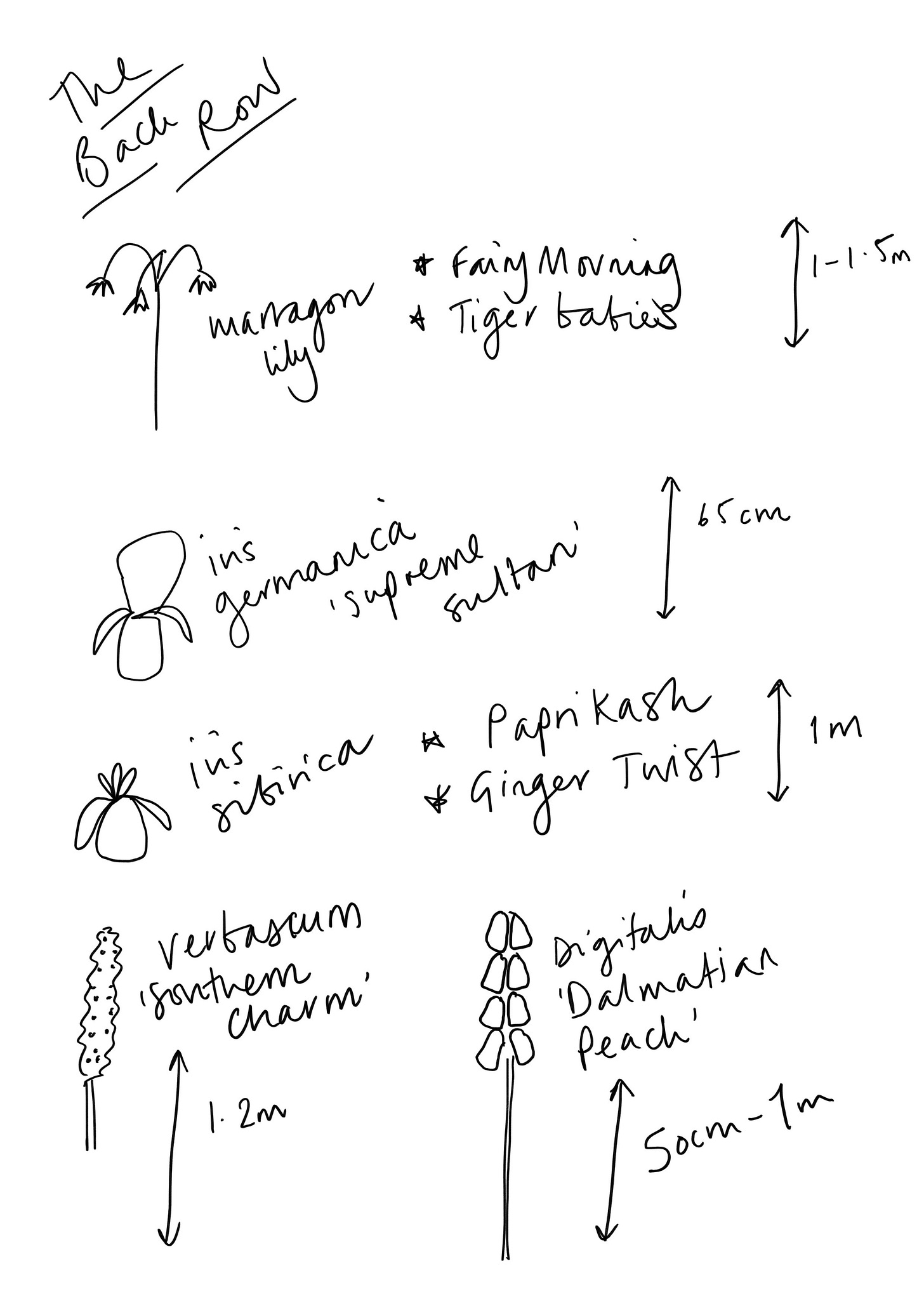
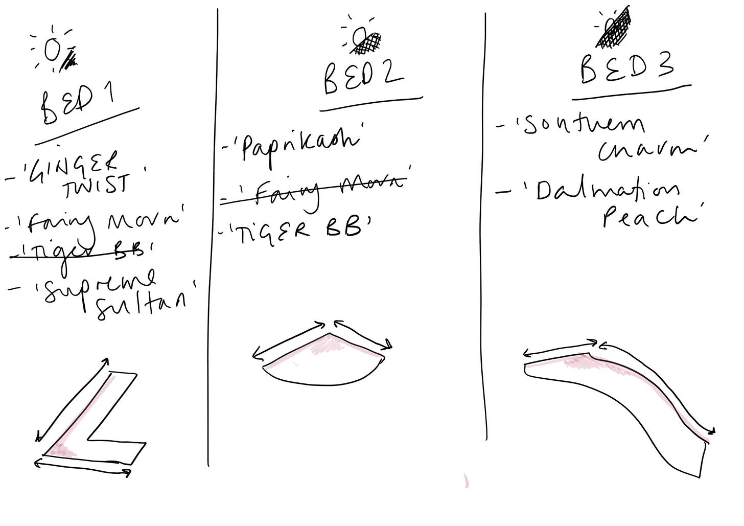
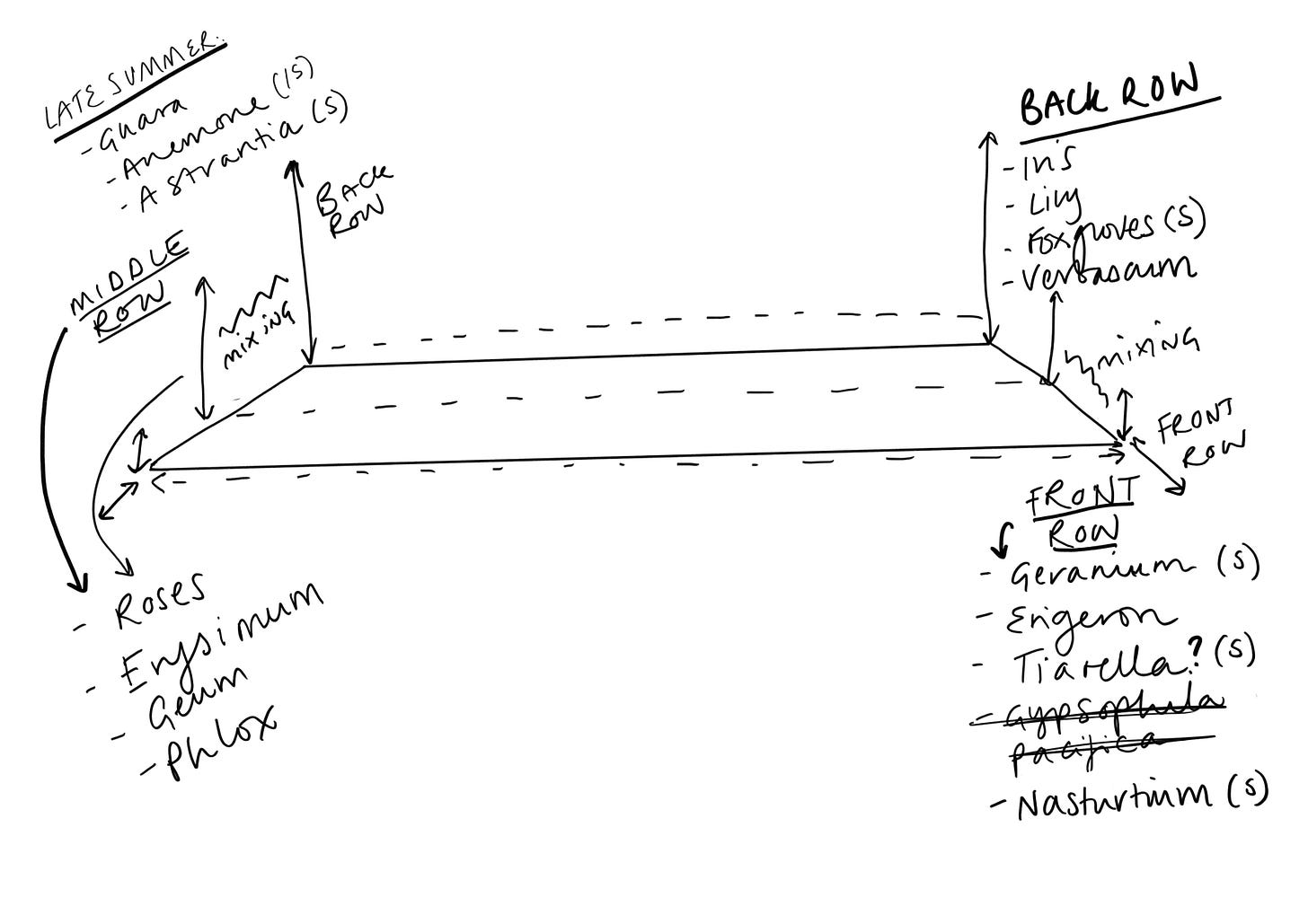
[ Early sketches of the offending scheme ]
Worse still, the colours have a negative physical impact . They make Nicolas’s “teeth itch” and “if they weren’t so insipid and lacking in any impact or drama or vibrancy would make me want to lie down in a darkened room like when I have a migraine”.
Reading this I was, as yet, still firm in my convictions. But then I read on.
Nicolas is actually plagued by my choices. He says “my very worst nightmare in the photographs you attach to plague me is, probably - as I’m hard-pushed to find a very worst - is Erysimum Spring Breeze Sunset. Although, even in such a very wide field, I could go with Rosa Lark Ascending”.
But - I hear you think - perhaps it is only because Nicolas is a man, and a burly man by all accounts. Not so. He says, “I don’t think it is that they’re feminine (I like lots of feminine things), I think it’s just that they are horrid”.
[ Further sketches, in the naive style ]
Confident that he has triumphed in his argument, Nicolas signs off: “I trust that this perspective on apricot, peach, clementine will not presage a parting of the ways.”
First, you are quite right Nicolas, I am a benevolent person and thus I will show you grace and will take your comment in the way it was intended - as a challenge to defend the honour of my new garden scheme, and not as a catastrophic breach of our new internet acquaintance.
Second, if you do not want to fight, do not express an opposing view to a former barrister.
Third, I shall number my paragraphs for ease of reference should you wish to lodge a rebuttal.
[ Don’t try and make sense of these ]
I am very grateful for the time Nicolas has spent in expressing his case so clearly. He has left us in no doubt of his position. It is difficult to argue with the assertion that certain of the colours included in the scheme may be considered ‘insipid’ individually, and I appreciate his making the point that it is not the palette’s innate femininity against which he lodges his objection, but to the fundamentally horrid nature of the thing as a whole.
Of course it is quite possible that the whole garden will look like a clothes line has collapsed and blown a load of over-washed, greying tea towels over the area and I am grateful to Nicolas for his timely warning.
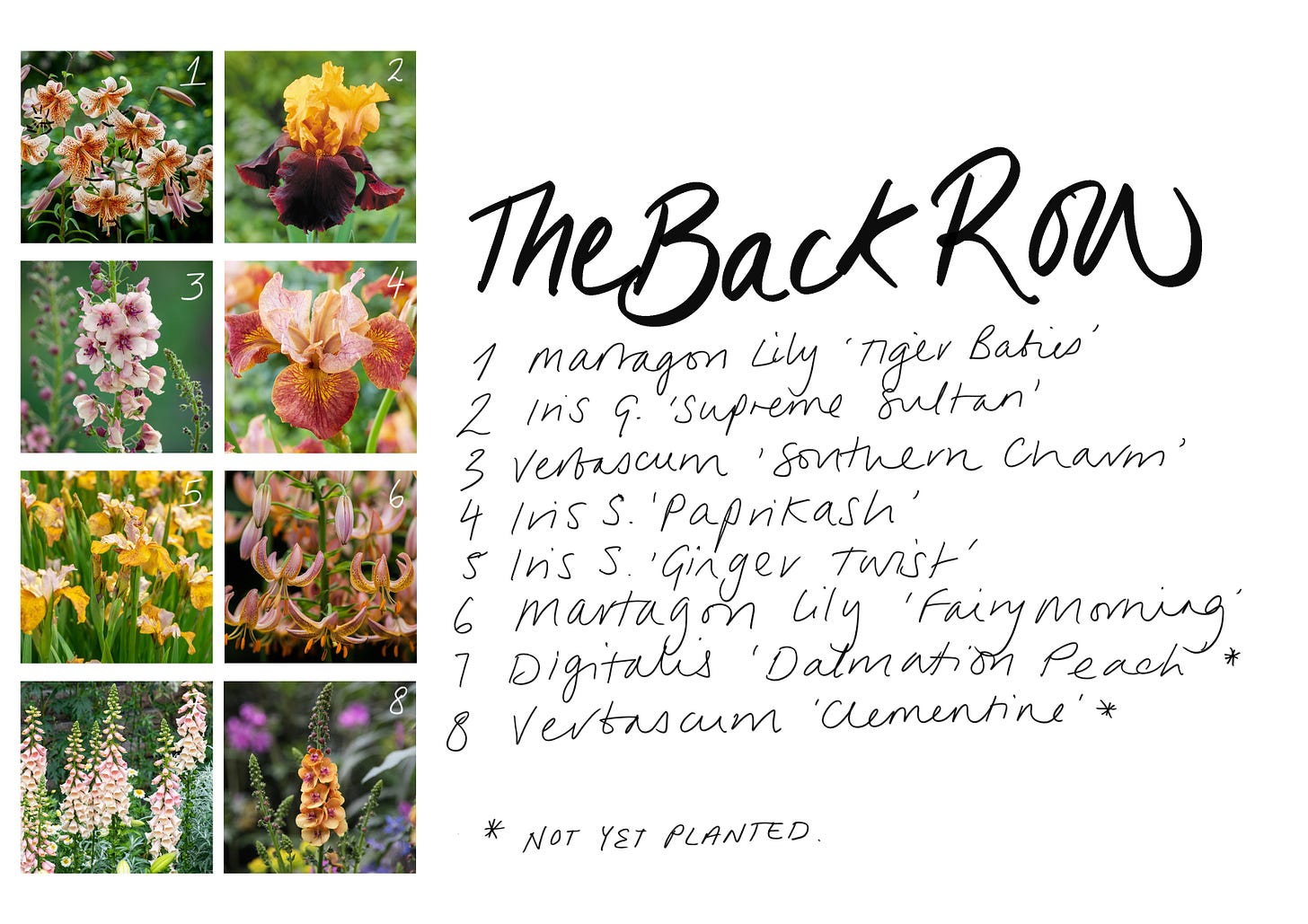
That said, I must disagree. Peach, honey, clementine, apricot, salmon, coral, tangerine etc are stunning, elegant colours for an English summer garden. I respect my readership, but I must object to this obviously wrong point of view. The ginger of the Iris! The mauve of the fading wallflowers! The fluttering indecision of rosa ‘Meg’ (is she coral? Is she peach? Is she a peony?). The shouty, clashing combination of the ‘de Rêscht’ with ‘Rachel’! Is this not the weaving together of harmony and discord that is the absolute pinnacle of all great art?
I would ask that consideration be given to the careful balancing at work in the scheme. On the one hand, certainly, individual elements such as ‘Mokarose’ could be said to be a bit… beige-y. It maybe that as a result of the ‘moka’ colouring, each flower appears dead even at the height of its bloom. But a plant in a border does not exist in a vacuum.
Such is the nature of a garden border that each plant should work and jostle along with its immediate neighbours, then with the border as a whole, and ultimately with the ‘big picture’ garden.
It is in his failure to consider the ‘zoomed out’ garden that I take exception with Nicolas’s argument. The garden as a whole will still contain trees, evergreen shrubs, pots, paving, brick walls, ‘borrowed’ elements from neighbouring gardens (mostly paving really, and some long-discarded toys and crisp packets), acres of blue (hopefully) sky, and so on.
In addition, inevitably (because each flower is attached to a plant) all the controversial colours with be mitigated by a significant amount of green. In her phenomenal book ‘The Well Gardened Mind: Rediscovering Nature in the Modern World’, Sue Stuart-Smith says:
“The colour green strikes the eye in such a way as to require no adjustment. Along with blue, it automatically takes us to a lower level of arousal. Esther Sternberg, a physician who writes about the properties of healing spaces, calls the colour green ‘the default mode for our brains’”
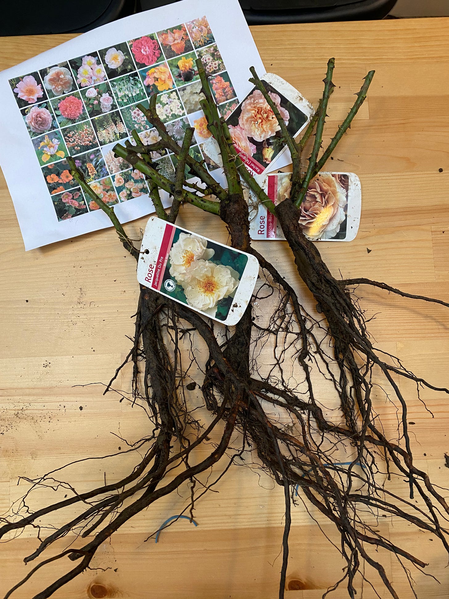
[ From planning to implementation, still oblivious to the controversy ]
Thus while the scheme is designed to be stimulating, it is - I would submit - unlikely to be overstimulating to the point of migraine. Arousal will be deadened by an abundance of green.
That said, in the event that a visitor feels overwhelmed, protective eyewear will be provided in the form of whatever old sunglasses are lying around. Darkened rooms can be provided with sufficient prior warning so I can shove the piles of clothes into a cupboard and make up the bed nicely. Itching teeth will be addressed by way of clear signage to the exit and provision of the address for the nearest A&E.
Luckily, the only ones likely to see the garden are myself, overlooking neighbours (probably oblivious), and two small dogs. As such, I am optimistic that the colour scheme will do limited physical harm.
I will leave aside the orange elements as those you say are “fine”, and will address instead the very “worst” element. There was a time when I might have agreed with you that Erysimum ‘Spring Breeze Sunset’ was my worst nightmare, too. After all, as I wrote myself in the original, offending post, they are “garish”, “quite terrible”, and “utterly ridiculous” not to mention being “a little bit of iffy taste”.
[ Further plans for the eyesore scheme ]
That said, I am sorry to hear that your nightmares are populated by these (it must be said, mostly orange) wallflowers. One ought not to be cowed by one’s nightmares. This Harvard Medical School article suggests that nightmares are caused by stress. Perhaps you associate the tutti-fruity colours of this Erysimum with a deep trauma you experienced on a Hawaiian beach? We can probe that further at a later date. For now, let me reassure you that when mingled with the other marvellous plants in this scheme the Spring Breeze Sunset will simply be a very small, barely noticeable part, of a greater, beautiful whole.
The ‘Spring Breeze Sunset’ is designed to provide a (very gentle, I stress) pop of colour against the quieter elements of the scheme. And here please note that “pop” is used in a purely descriptive capacity and does not denote any literal, explosive sound emanating from the plant. Or certainly none that I am aware of.
Again, to quote Stuart-Smith’s must-read book:
“Plants may sometimes be spiky or poisonous, but they will never make sudden movements or jump out at you, so you don’t have to be on your guard or watch your back when you are working in their company.”
So you see, really there is nothing to fear save for the existence of poor taste in other people’s gardens which, I accept, is indeed distressing.
One point of clarification, per my previous post I have not yet purchased rosa ‘The Lark Ascending’ due to my reluctance to pay the full David Austin price of £23 for a bare root rose. Should there be any further development, for example unexpectedly coming into funds, I will of course take your deep aversion to this rose into account before proceeding with the purchase.
As the fruit salad scheme is indeed an experiment, I can only hope that you are entirely wrong and that it is a triumph. In the event that it is a migraine-inducing disaster, there is always next year for a course correction. For now, please stay tuned to this feed for further updates. I will endeavour to include a trigger warning prior to the posting of any further photographs of the dreaded wallflower.
Thank you so much for your time and attention in this matter.
Lucy
[ Edit: I just learned that this palette has a name. Sarah Raven calls it ‘Soft & Warm’ and I should have realised that Sarah would have the answer ]


For people, other than the esteemed horticulturalish who will be clear on this point, reading here: I am Nicolas , horticulturalish’s burly reader.
I am resolute in my position. Even in the face of the combination of horticuralish’s skill with her pen and her legal mind which she puts to devastating effect and passionate defence.
horticulturalish allows, as per our legal framework, for the possibility of a rebuttal.
However, I am not sure that after last night excesses at a gay Burns Night (where horticulturalish’s fame spread giving her a growing fan base of gay men which I feel would not, perhaps, have happened without my views on her plant colours; and, from some members of this festive gathering I was reminded that not everyone always appreciates me swaggering around being the burly leatherman all the time when it comes to some things that matter to them - like planting schemes - and perhaps I could have put my thoughts a little more sensitively, some even adding that they loved her proposals) I can summon the thinking power to set out a rebuttal as incisive and well put together as horticulturalish’s position.
So, I guess what I would say is that I’m very pleased that horticulturalish’s reservations about her planting scheme has been, as per her first paragraph, been brought into sharp relief by my response. But, far more importantly, that she has not wavered in the broad sweep of her design, that she has held it close and defended it and argued its case and loved it with much of the arsenal of courtroom drama at her disposal.
And so, the papers now filed and before us (although the force of my arguments may be slightly diminished by all that haggis, neeps, tatties, and Scotch), perhaps we should conclude David Hockney’s view that “there are no off-putting colours” (I just won’t go with Sarah Raven’s “soft and warm” - but then no-one would expect me to).
And, of course, wish horticulturalish every success with her planting because gardening is a great joy.
Loving this in-depth response. When I trialled a similar colour scheme in front of 175k actual visitors at Chelsea in 2019, (not counting the world wide audience), I was worried that I’d gone mad… I asked myself why on earth I would decide to experiment with something that hadn’t been done before in front of all those visitors instead of just trying it out at home?! BUT people really enjoyed it- so I’d say GO FOR IT- as long as there’s something to tone it down . The pinks and the peaches work together in the sweetshop way I’d designed, and I’d included deeper colours in other areas as you want a contrast of tones for the paler ones to shine against, and to ‘slice through’ . So contrast and depth of background are always good.
I think it’s going to be beautiful….
Also, I live your kindly forensic approach to your in-depth great reply!